Pages

Monday, July 30, 2012

Growing up

It feels like I legit aged five years in July. My little sister had her bachelorette party, got married, and I got promoted--all in the span of four weeks (okay, admittedly the wedding stuff has been in the works for the last year and a half but still, it all came down this month). 

First, the bachelorette party. We spent the night being entertained by drag queens, watching wet underwear contests, and being showered (literally) by champagne all in the Hillcrest area of San Diego. I think I speak for everyone when I say it really was a night to forget after all the alcohol consumed remember! Our theme was animal print, and the invitations that went out stated it was going to be a "wild" night, hence all of us dressed up like jungle queens!


Next, the wedding. There were a lot of DIY aspects and it was a ton of work. But I know when my sister looks back at her photos, she won't remember all of the stress and running around; she will remember how utterly gorgeous she looked, and how we transformed a conference room into a sparkling garden for her special night. 


Me cheesing it up as a bridesmaid (hey, it's my blog; I have to add a gratuitous shot). Besides, our dresses were too cute not to show off (her colors were navy blue, apple green, and touches of white and ivory--proud to say I helped her pick that combo)! 


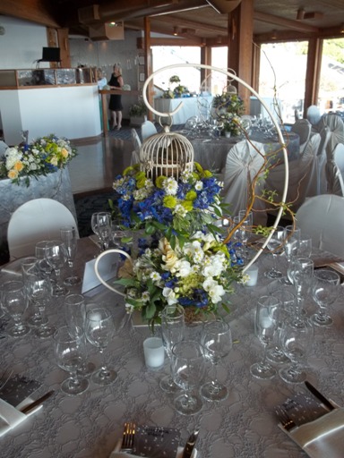
I totally came home with the top portion of this centerpiece (the birdcage, complete with faux-feather friend and nest inside). Plans currently include painting the cage in either an oil rubbed bronze finish, or the same rusted-look finish I still hope to do on our bed. 


By the way, they got this super adorable, super customized cake topper on etsy. The bride bird's dress looked just like my sister's wedding gown! And normally her husband (my new brother-in-law!!) wears glasses, so we were totally tickled that they included those on the groom bird. Cutest. Cake topper. Ever!


The hanging light orbs are actually baby's breath pomanders with LED's wrapped inside. In the background you can also see the fugly carpet wrapped pole we hid with fabric and more baby's breath, the blue lights they had glowing up on the stage, and the trees they rented to create a more outdoorsy feel inside (I so didn't know you could rent trees!). They also had votives flickering on metal screens our dad made just for the occasion (shameless family business plug here). 


And last but not least: my promotion! I totally wanted to include it in this post, but it was getting so ridiculously long, even I was getting tired of reading it! Ha! So you'll have to forgive this minor cliff hanger, but I'll be back Wednesday with more gossip on the new corporate frontier. In the meantime, I hope you enjoy skimming over my sister's gorgeous nuptial photos again, and check out the shameless family plug if you're a SoCal local.

BTW: I'm shocked at how many random Jersey Shore moments we had at the reception. Imagine myself and my baby sister's British boyfriend fist pumping the air and screaming, "Oh yeah! Fist pump yeah! Oh yeah! Wedding yeah!" in the spirit of Pauly D. #culturalfail  

Tuesday, July 24, 2012

Knock-off bedding

West Elm's Organic Cotton Pinch Pleat bedding. Super sweet without being too girly in a ruffled Shabby Chic way, but still has something modern-ish about it. Too bad even on sale it's over $100 for the duvet and two standard shams. 


Awesome alternative: Target's 100% cotton Pinched Pleat duvet set. No, it's not organic but it's not full of synthetic fibers either. And a queen set was only $70. 


But let's pretend it's not on our still-green bed, that I'm not hiding the rest of the room from view right now in its mid-makeover state. It's not quite as "pleaty" as the West Elm version, but I can't honestly say that bothers me. I'm dying to get a wide shot of the bed and the room, but it's very mismatched right now (and not in an eclectic collected way). But for now, it's l♥ve.

Friday, July 20, 2012

Americana tea towels

When I was hunting down a graphic for my Pinterest challenge, the one I settled on actually made me remember another project I had seen (and pinned), ironically also from YHL.


I loved this pop of red from the bike. The image was so cute and fun, and my first thought was it would be so easy to make something like that! I'm a huge fan of iron-on transfer paper for just about any project involving prints and fabrics (I guess I'm old school since I haven't jumped on the Cricut or Silhouette bandwagon). I recently picked up some super cute tea towels from IKEA (for all of 79¢) at the beginning of the month and I thought, along with the red stripe on the towel, some blue images would add that sweet little Americana kick I seem to be on (I blame the month of July; how can you not be patriotic?). 

My bike image came from The Graphics Fairy (it's the same image I used on my galvanized tin, just minus the advertising words), and the other two images I found on Google. I really wanted to stick to the whole vintage transportation theme, and I wanted the pictures to look hand drawn or sketched. 


I changed to tint to blue (I use PowerPoint to edit all my images--I'm way old school) so they all looked alike. I pressed the towels in a folded position so I knew exactly where to place my images. The iron-on paper says not to use an ironing board, but a hard surface covered with a pillow case (??). This created way more trouble than it was worth, so I just laid a towel over our ironing board and it seemed to work just fine. I really don't understand how iron-on paper isn't supposed to be used on an ironing board. But whatever.


Thanks to the nubby texture of the tea towels, the graphic take one an almost ghostly transparent effect. I really like the way they turned out, even though they're not as crisp and bold as my inspiration. They look a little more time-worn which actually pleases me more than I expected.


I may grab a few more towels on our next trip to IKEA and add some orange or brown images for fall, and some green ones for Christmas. 

Wednesday, July 18, 2012

We are not amused

Our bedroom makeover is slowly becoming the bane of my existence. On the one hand, I recently purchased my most favorite bedding (being washed and dried as I type!!), found some adorable accessories, some graphics I want to use on a few pillows, purchased curtains, and managed to find a stash of books I've been hunting for specifically for their spine color (I love to decorate with books). So at least that part is off to a good start; the finish of the actual bed is becoming a royal pain in the arse however!


I picked up two tubes of Rub 'n Buff in "Spanish Copper" from Hobby Lobby, hoping to achieve that old-world-meets-semi-rusty-meets-amazing-piece-of-furniture-that-didn't-come-from-IKEA bed. Yeah...not so much.


Part of the problem is my product which should have come out like a waxy paste consistency was coming out in straight liquid form. I don't know if Hobby Lobby let it sit too long on their shelves or what, but I've worked with RNB before and this was not what it should have been. Also, the color? Not so much "copper" as much as "mud." I really do think I got a bad batch, but it's getting returned either way (I mean hey, that $11.50 can buy me a few cans of spray paint).


Which looks like that's where this project is heading. I wanted to try and do everything I could from disassembling the bed, hauling it downstairs, taking a week to paint, cure and off-fume, hauling it back upstairs, and reassembling it. I paint quite the dire picture don't I? But it doesn't look like this is going to be an in-room project. Now I just have to find the right finish and color. Right now it's a toss up between Rust-Oleum Hammered Finish spray paint in copper or brown, or their Multicolor Textured spray paint in autumn brown (I'm honestly hoping this looks as good in person as it does on their website). 

Guess a trip to Home Depot is in order...

Monday, July 16, 2012

Woooooo's there?

Before we moved to our new town, the closest I'd been to Hobby Lobby was my keyboard. Now that I have one within five minutes of our house, I'm always finding reasons to pop by (invitations and goodies for my sister's upcoming bachelorette party and wedding, Rub n' Buff for our bed project) and recently I found the perfect door stop for our master bedroom there as well.


We like to leave our windows open during the day, but the constant slamming of the door was getting annoying; not to mention it sent Tessie running and barking (squawking?) like Chicken Little. This little iron owl is heavy enough to keep the wind from shutting the door, but not so heavy that if we run into it barefoot we're going to break a toe. Perfect.


I'm debating on weather to leave him in his natural state or if I want to paint him bright yellow or lime green for a fun splash of color against our white door and brown carpet.


FUN FACT: recently, at my sister's bridal shower, we were reading an old wive's tale book of ways to bring luck and happiness to your new marriage. Placing an owl figurine near a window was believed to ward off evil spirits.

Thursday, July 12, 2012

IKEA Markor bookcases revisted

Note: Unfortunately IKEA no longer carries this line. 
Which is a huge bummer because the bookcases are sturdy and gorgeous!
And by the way, I apologize in advance for using the word "bookcase" 13 times in a single post.  


I first introduced these to you on Two Nuts in a Shell in our office reveal post. This was back at our old house when we actually had a designated room for an office. At the new house, we've lost about 350-square feet, and one of the rooms that was nixed was an office. We have a loft/landing area upstairs that's been serving as our "study." It's basically our Expedit workstation and office chair. 

Before I continue with my bookcases, I have to take a side road for a second. A few weeks ago, Jason and I were talking about buying a smaller Expedit shelving unit for our bedroom (apparently we like the furniture collection) so we would have more storage. We even had it all picked out at IKEA, we just never pulled the $60 trigger. Thank goodness!

Back to to the bookcases. We managed to find a new home for one in between our couches in our living room (sounds odd, but looks really cool), but the other was taking up space in our little dinning room. Confession:  I haven't even moved the table in yet because it would have look so crammed in there with the bookcase. And then I had what I thought was a brilliant idea: I would take apart our current desk, reconfigure a shelf on our bookcase to sit at the same height, combine our bookcase with our desk, thus leaving me with an Expedit shelving unit for our bedroom! Genius! And, insane. It was way more work than I expected but gave me such a big payout that I don't regret a single f-bomb that was dropped.

I made sure to measure the depth of the pre-existing bracket holes so I wouldn't wind up drilling through the side of my bookcases. Using painter's tape was the easiest way to know when to stop drilling; no guess work involved.


Once all four holes were drilled and the brackets had been hammered into place, I held my breath and wiggled the shelf into the bookcase. 


Success! It's level!


I won't lie, this was only attempt number one. Turns out I miscalculated when measuring the height of the original desk portion, plus I didn't take into account the thickness of the bookcase shelf. So it took two more grueling, sweat-inducing tries before finally getting it all right (during which the desk was dropped on my foot and I got pinched by my pliers resulting in a nice little blood blister--both produced f-bombs). But once all the hard work was done, it was time to reassemble and enjoy!


A few shots of the decor I've got going on right now. The three little books resting in the nook are some of my favorite details since they make the extra gap look a little more deliberate, as well as hide the brackets that attach the desk to the bookcase. 


I'm super stoked with the extra height the bookcase adds, not to mention I like that it mixes the modern straight desk lines with the semi-decorative molding on top. The colors are only slightly off (they're both IKEA's signature "black-brown" color, but the desk is more solid whereas the bookcase has more of a "wood grain" look to it) but it's not enough to bother us. 

Now all we have to do is move the Expedit section into our bedroom for some added storage. And the best part of all our blood, sweat, and f-bombs is we didn't spend a dime!

Tuesday, July 10, 2012

Summer Pinterest Challenge {part 2}

I shared last week that I was going to partake in YHL's seasonal Pinterest Challenge for the first time ever. I perused my Pinterest boards to find just the right inspiration (or as Sherry would call it, pinspiration) and came up with these.


(find these pins: one, two, three, four)

I opted to go with pinspiration number two, which is a galvanized tin adorned with a vintage graphic label (the original pin came from my computer, but I saved it from The Graphics Fairy). I was trying to be budget savvy and I knew I had all the supplies for this on hand (minus the Mod Podge, which I needed more of anyway). I grabbed my tin that I'd picked up from Michael's last spring/summer for $13. How do I remember the price? I never took the tag off the bottom! Oops!


I chose and printed my graphic (from none other than TGF), but before I started Mod Podge-ing away, I decided to add a little something extra. I busted out my rusting kit (from my failed attempt to rust our bed that I shared with you here) and painted the handles with the iron paint. 


After the 12-hour dry time (I still hate that it has to sit up for that long), I applied the rusting liquid. Aaaaannnddddd...


Again: wop wop wop. This is now the second time I've tried to use the Sophisticated Finishes rusting kit, and this is the second time I've been highly disappointed. I made sure to generously apply the iron paint (an easier job this time than the bed since I was only working with such a small area) but the rusting only occurred on two random spots on one of the handles. At least I don't feel so bad for the epic fail on the bed frame. 


Meanwhile, I took my label and tore the edges slightly so it wouldn't have a perfect scissor-cut look. Then after some crumpling and steeping it in a bath of Earl grey tea for age... 


...I applied a smattering of Mod Podge. It now resides as a trash can in our laundry room. As far as my other pinspirations go, I'd still like to try and tackle them in the near future. Now that I have one successful pin-turned-project under my belt the others don't seem as difficult to start. 


Check out the other takers here on YHL's Summer Pinterest Challenge!

Friday, July 6, 2012

Misadventures in rusting

So, we purchased a new bed frame for the first time in six years. We'd been using a plain old Wal-Mart metal frame just to keep our box spring and mattress off the ground, and I had made a large tufted headboard for it. It was fine, it got the job done, but it wasn't very sturdy. When we moved into the new house we knew it would be the perfect time to find something we liked with a bit of character. We picked out the Leirvik bed from IKEA. I loved its whimsical shape, Jason loved its price tag ($99 for the queen size). After painting it apple green we realized we weren't as thrilled with our color choice as we thought we would be (forgive the almost bare bones bed--I was in the process of washing sheets and just threw the comforter on there).


So we thought we'd add a little Americana style to our quirky bed. I purchased a Sophisticated Finishes rusting kit from Michael's, and decided to test a small area of the foot board with it. I wasn't super impressed that you had to wait 12+ hours in between the iron paint and the rusting agent, but once the time passed I was more than excited to apply the blue watery liquid.


Cue the wop wop wop sound effect. Apparently, I'm going to have to glob the iron paint on, as the rusting agent doesn't seem to grab onto the minute areas of grey. Also, the foam brush I was using sucked. Within just a couple swipes it was falling apart, and the coverage ranged from heavily applied (the areas that rusted) to barely there. And it was near impossible the even it out. Boo.


But, the more I looked at it, the longer I also realized...it kind of just looks like brown paint. I don't know what I was expecting but it doesn't look particular rusty, except in color, so I'm not even sure if I want to give it another go. 

I'm trying to find some better ideas out there. The Sophisticated Finishes site says to also use their "patina" finish in conjunction with the rusting finish to give it a more authentic look. But at $12 a pop for such tiny bottles, I think they're just out to finagle my money!

I came across a few helpful tutorials, like this video on YouTube and this one from Krylon's website. And I've used similar products to this Gilder's paste on etsy (there was a time when practically every metal that came into our home got a treatment of Rub n' Buff silver leaf). I think I may try that technique before I run out and buy more kits as I know how well it works, and it's not a wallet buster.

So the adventure continues! In the meantime, tomorrow we celebrate an anniversary [insert ginormous grin here] and I'll be finishing up my Summer Pinterest Challenge just in time for the reveal on Tuesday!  

Wednesday, July 4, 2012

Summer Pinterest Challenge

I've long been a fan of Young House Love, and every time Sherry holds one of her seasonal Pinterest Challenges I always swear I'm going to join in. And I don't. So I set out to make this my rookie season. I hit up my Pinterest boards to see (and remember) what I've accumulated. These are the ones that are inspiring me the most and the ones I know I can manage in the short time frame (these came from my DIY board).


1. This cheese dome caught my eye because of the gorgeous retro green color. For some reason I'm a sucker for that shade when it's done on the right items (old scales especially). And I have a cheese dome that I painted a basic boring black that's just screaming for a refresher. If I can find the right shade...
2. This sweet little galvanized tin was something I saved from The Graphics Fairy (back before Pinterest was around and my computer housed folder after folder of saved images). I think the right decal could really add a pop of the unexpected.
3. The new trend of using trash cans as side tables has me hooked! It's so simple and so cute. I have a perfect spot in our living room for a small cocktail table that would add a layered look to what we have going on now. This may require a trip to Home Goods if I take this challenge.
4. I've never been one to make my own art, but this tape art canvas seem to be something even I can manage (I don't think I ever progressed past the coloring book phase in my quest for artistic fulfillment). Our house has a lot of browns going on in it, so a hot pop of orange or lime green may really set them tone on these walls.

Pinterest Challenge accepted.